Quick summary: AI can get a homepage started, but I still have to bring my own taste, experience, and customer research. I rejected three concepts this week because they looked and sounded like AI. Better references and repeated feedback are how I work toward something I'd actually want to put in front of a customer.
“Build me a website with AI that doesn't look like AI.”
It's a funny thing to ask an AI. It's also pretty close to what I want every time I build a website now. I want the speed, but I don't want somebody opening the page and immediately thinking, yeah, I've seen this exact thing forty times this week.
I do that myself. The little uppercase text above the headline. The giant vague promise. Three cards that could belong to any product. A screenshot that looks impressive until you realize it doesn't explain anything. I start skimming before I've even figured out what the company does.
This week I had Codex build three homepage directions for a product I'm working on. They had different layouts and different angles. We had a design brief, references, and actual product context. I still didn't like any of them.
The design looked like AI. The copy sounded like AI. I could see that we'd generated three options, but I didn't feel connected to any of them. That's a pretty big problem when I'm supposed to use one to connect with somebody else.
I asked for headline variations next, but better headlines alone weren't going to fix it. I needed to keep working on the whole page: what it looked like, how it sounded, and whether it felt like something I wanted to put my name on.
Three homepages I didn't want to ship
These are actual hero sections from our October 6 exploration. I've withheld the unreleased product's name and imagery. This was one product explored in Codex, not a comparison between three models, and we didn't run a conversion test.
The product helps people manage product feeds and prepare products for advertising. We tried three directions. My first reaction to all three was that familiar AI feeling. I didn't need a detailed conversion critique to know I didn't like looking at them.
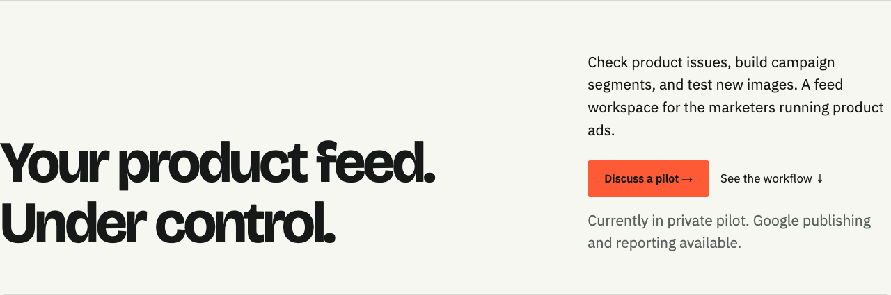
The first concept.
The oversized, tightly packed headline, pale background, and little orange button felt like a page I'd already seen. “Your product feed. Under control.” sounded like the kind of neat little slogan an AI gives you when you ask for homepage copy. Together, the words and the design felt generic to me.
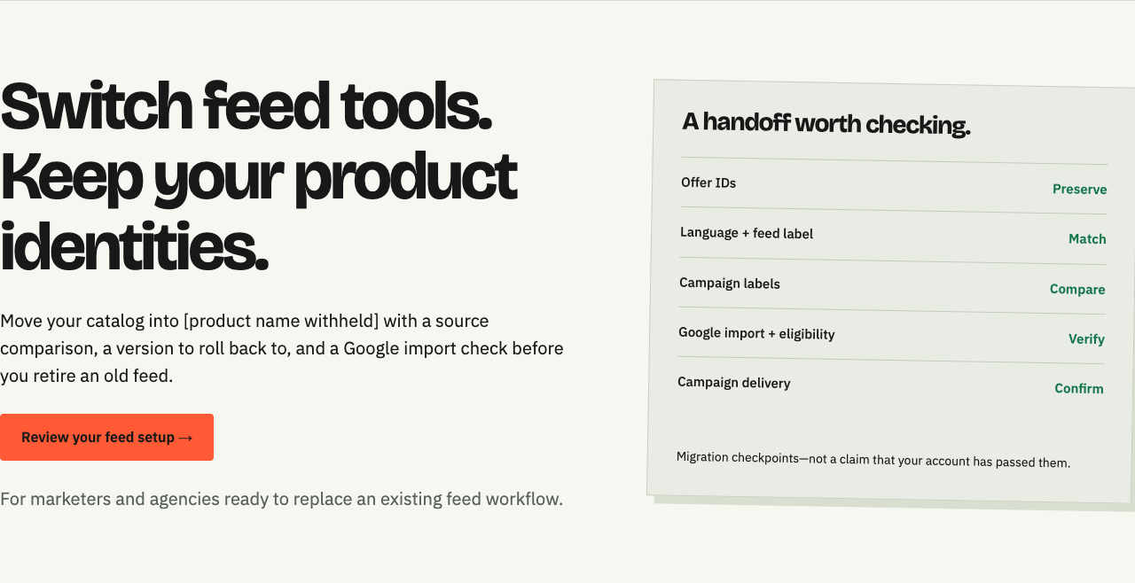
The second concept. Product name withheld.
This one changed the message to switching tools. I still had the same reaction to the overall design, and “keep your product identities” didn't sound like a person talking to me. There were ideas in it we could work with, but I wouldn't have shipped it.
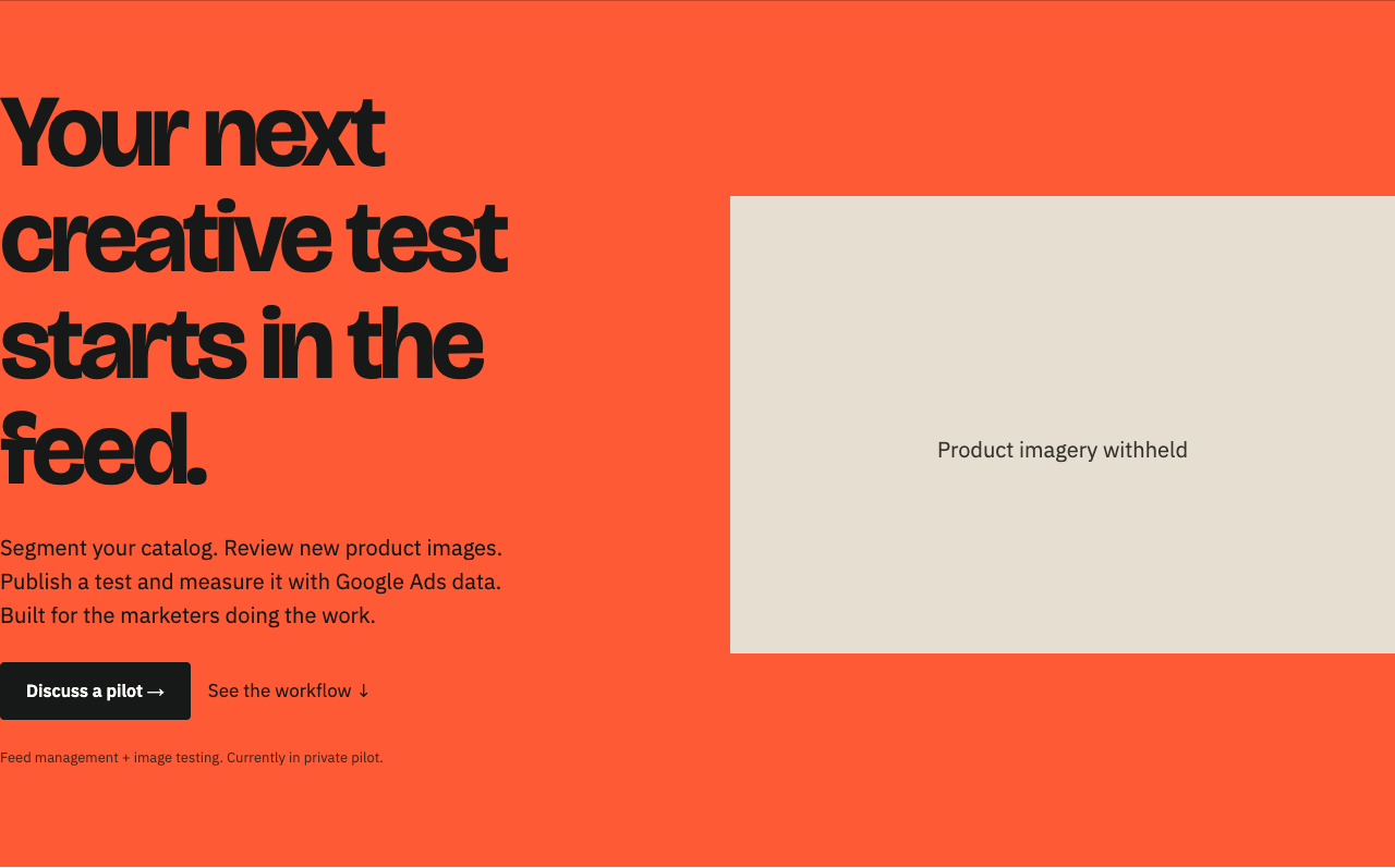
The third concept. Product imagery withheld.
More orange, big type, a different arrangement. I still didn't like it. It's easy to generate a version that looks different from the last one without getting closer to something you love.
These gave me something to react to. That's a big part of how I use AI: give me ideas, let me see them, and then we can go back and forth. I haven't picked a winner here. I also don't want to pretend the rejection was some perfectly reasoned marketing exercise. Both the design and the copy felt generated, and I wanted to keep working until they felt like mine.
People buy from people
I come back to this a lot. Someone lands on your homepage, and you're trying to connect with them well enough that they'll consider buying something from you. I want them to feel that somebody understands their problem and cared about how to explain the product.
AI can help me get there. It can give me a layout I hadn't considered, ten ways to say something, or a quick version of an idea I couldn't have built myself. I still have to bring my experience with the problem, what I've learned from customers, and my own eye for what looks good.
Sometimes that means knowing exactly what to change. Other times it starts with “I hate this” and finding references that help me explain why. Looking at pages I love, figuring out what I love about them, and bringing that back into the session is part of the work.
I think that work will matter even more as it gets easier for everyone to generate a homepage. If I stop at the first usable output, I'm asking people to care about something I haven't spent much time caring about myself. My taste can be wrong, of course. That's why I need customer research and feedback alongside it. But I have to make a judgment somewhere instead of asking the AI to make every decision for me.
What I mean when I say it looks like AI
For me, it's often a pile of choices that nobody seems to have questioned.
I hate the decorative little eyebrow text that sits above every section. I keep calling it eyelash text. Sometimes a label helps you understand where you are. A tiny all-caps slogan that repeats the heading is just another thing to read.
Then there's copy like “unlock your potential” sitting above six equally important features. Everything has a card. Everything gets an icon. The product itself is somewhere below all of that.
None of those individual choices proves AI made the page. I found a Reddit discussion about beige websites where people were already associating cream backgrounds with AI. In another discussion, the proposed escape from purple gradients was another reusable palette and font recipe. We can replace one default with another pretty quickly.
These are anecdotes, not a survey of the industry. And people in this web-design thread make a fair point: websites looked alike long before AI. Templates didn't start this year.
I'm less interested in detecting AI than in whether someone made decisions for this particular product. Can I tell who it's for? Does the image show something useful? Does the most important information actually look important? Would the headline still work if I swapped in a completely different company's logo?
That last one catches a lot of weak copy.
The words are part of the design
Danny Postma has been talking about this on X, and his research-to-shipping process is worth looking at. His landing-page course starts with customer research, then moves through copy and page structure before visual design. That's the part I like. The screenshot below is his process, not something we invented.
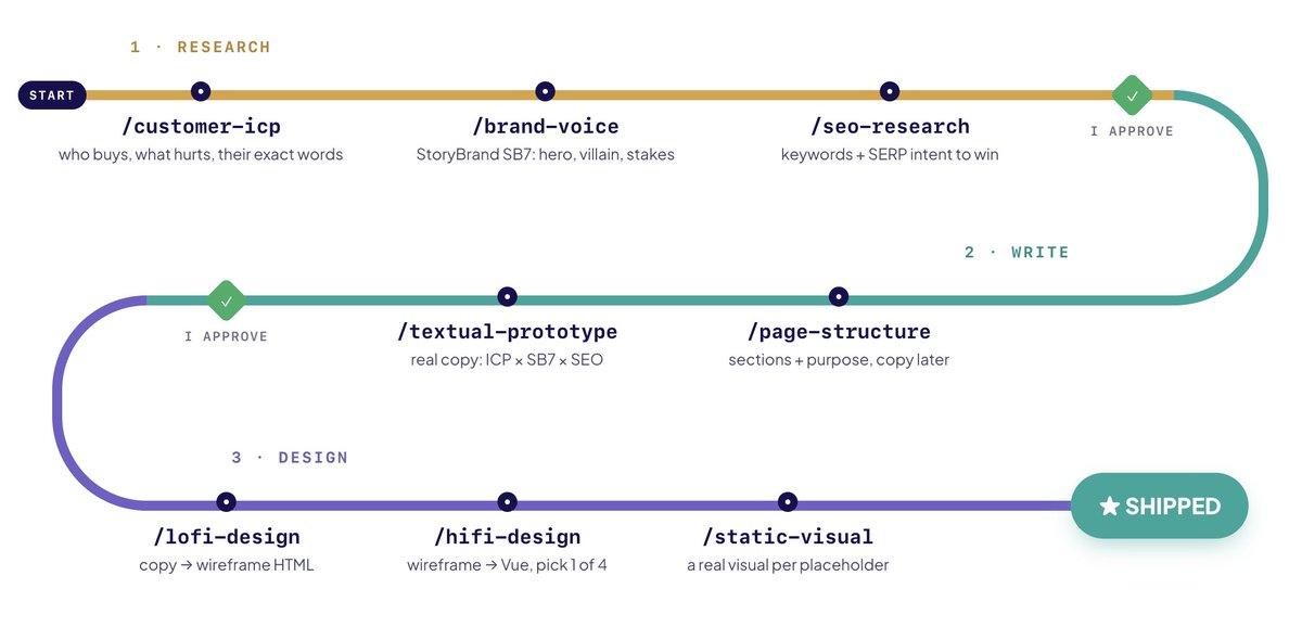
Danny Postma's process, shared in his posts. Source and course.
If I give an AI a feature list, it can turn that into a perfectly grammatical page that says almost nothing. If I give it the problem someone described, what they tried before, and what would make them switch, it has something to work with.
I'd rather start with a handful of actual conversations, survey answers, or support questions. Keep people's original wording beside the draft. Ask the AI to separate what customers actually said from what we're inferring. Don't let it turn a guess into a quote because the quote sounds good.
Then pick the main promise and put the evidence near it. If the promise is an easier migration, show the comparison and rollback. If it's faster campaign setup, show the steps somebody gets to skip. That choice affects the screenshot, the layout, and what goes above the fold.
This is why “make it more premium” tends to waste my time. It doesn't tell the model what the page needs to communicate.
Which AI is actually best at design right now?
I went looking for something better than a feed full of selected screenshots. The most useful evidence I found was Contra Labs' designer evaluations. They also made me less confident in a single winner.
In an August landing-page study, six designers made 3,240 pairwise judgments across six models, three fictional products, and three stages of work. Claude models led overall, but GPT-5.6 Sol led the initial ideation stage. The preferred model changed between concepts, mockups, and refinement.
Their September 14 update put Claude Fable 5.1 first overall and GPT-6 Astra second. Astra was strongest at the mockup stage, but trailed Fable 5.1 and GPT-5.6 Sol in ideation. That's a useful shortlist, checked for this post on October 7, rather than a reason to move every project to a different tool.
There are real limits here. These are judgments about generated designs on a small set of briefs, not evidence of higher sales. Contra's comparison across four evaluations also shows how rankings changed across different setups. Prompts, assets, evaluators, and workflows changed together. You can't credit one of those factors with causing the result.
My practical take: keep Codex as my main building environment and try Claude Fable 5.1 as a second design opinion when a direction is stuck. GPT-6 Astra is worth testing for detailed mockups. I haven't run a controlled comparison of those models on my own product, so I'm not going to present someone else's evaluation as my personal result.
The client matters too. Codex and Claude Code are work environments; a model ranking doesn't tell you which interface you'll prefer. Here are a few different workflows worth knowing about:
- Claude Design: useful to evaluate if you want a visual canvas, direct edits, and comments before handing work to Claude Code. That's its documented workflow, not a claim that its output always wins.
- v0: worth a look when you have an existing design system or a reference screenshot. Its docs cover screenshot inputs, design systems, and selecting elements to change their styles. Supplying your own system matters when you don't want another default component-library page.
- Google Stitch: another option for exploring UI on a canvas. Google's Stitch update describes working with design context and an agent. I'd treat it as a place to explore directions, then judge the result against the actual product.
A better model might give me a better starting point. I'll still need to look at the result, decide what resonates with me, and keep working on it. I wouldn't expect switching subscriptions to supply my taste or my understanding of the person I'm trying to reach.
The resources in my setup
These resources have helped me explore ideas and find more specific ways to talk about design. I use them alongside my own collection of pages I love. We had resources in place when I rejected all three concepts; using them well takes more than installing them and accepting whatever comes out.
- Impeccable: design guidance and commands for critique, auditing, and refinement. Useful for turning a vague dislike into specific things to inspect.
- UI UX Pro Max: a reference for typography, colors, layout, and usability. I want it helping with choices, not picking a fashionable preset and calling the job done.
- Marketing Skills: product context, copywriting, and conversion-focused guidance. The design has to carry a message someone cares about.
- Danny's explore-design skill and screenshot skill: useful starting points for exploring directions and inspecting real pages. Our local exploration workflow follows this kind of approach.
I also keep the product brief and design decisions with the project. That includes who it's for, what the product actually does, the real assets, and preferences like avoiding decorative overlines. Otherwise I end up explaining the same things every time we touch the homepage.
How I'm tightening the process
I want to give myself room to go back and forth on both the design and the copy. Who's reading this? What have I learned about them? What do I want the page to feel like? What would make me stop and look if I were the person opening it?
I'll bring references I actually love and explain what I see in them: the spacing, the photography, the way a product demo sits beside the copy, or how naturally the headline reads. I might like one page's typography and another's use of screenshots. That gives us something specific to explore without copying a whole website.
Then I want to see it, react, and try again. Keep the parts that feel right. Change the type if I hate it. Rewrite the sentence I'd never say. Try a less predictable layout. Sometimes seeing the next version helps me understand what bothered me about the previous one. That back-and-forth is a huge part of designing with AI.
Once there's a direction worth keeping, the feedback needs to get concrete. “The headline is too broad.” “I can't read the product screenshot on my phone.” “These three sections repeat the same claim.” “The CTA doesn't tell me what happens next.” Those are changes the AI can act on.
There's an interesting parallel in Anthropic's research on long-running app-building workflows: their process used explicit evaluation criteria, separate generation and evaluation, and browser inspection to improve the output. It's vendor research, but the practical point matches what I need here. Render the thing and inspect it. Don't accept a confident description of how good it looks.
Before shipping, I'd check the mobile page, the actual form, loading and error states, and whether the images are readable. The backend needs testing too; working-looking code isn't proof that the system is correct. On the frontend, I also want someone unfamiliar with the project to tell me what they think it does and why they'd use it.
If their answer is different from what I'm selling, I have more work to do.
For this homepage, I'll keep collecting references, working through the copy, and giving feedback on the actual designs. AI got me started. Getting to a page I like enough to put in front of people is going to take more work from me.